David Carson

david carson head shot

By Peter Plagens and Ray Sawhill

Now read this — or try to, anyway: words in oddly mixed capitals and lowercase with some letters blurred, overlaid on photographs or crammed into little tilting boxes. That’s just a magazine page, which at least stands still. Try TV: the same, except everything moves — in and out, up and down, over and under — to the sound of giant gears grinding and a voice-over hustling Hardee’s burgers or Glendale Federal’s friendlier checking accounts. (Hitting the MUTE button doesn’t stop the sell; the type keeps on coming.) You start to feel like a top gun with a MiG in his sights, doing a barrel roll at 900 mph.

If you can read any of it, you’re probably under 50. If you really like it, you’re most likely under 30 and recently weaned from your skateboard. And if you dig it enough to stand in line and pay $10 to hear the designer of all this give a lecture, you might be a starry-eyed student at New York’s Cooper Union or Michigan’s Cranbrook Academy of Art, and David Carson has been your graphics hero since you subscribed to the magazine Ray Gun. Like, you’re probably carrying a just-bought copy of Carson’s and Lewis Blackwell’s new book (with a foreword by Carson client David Byrne) “The End of Print: The Graphic Design of David Carson” (Chronicle).

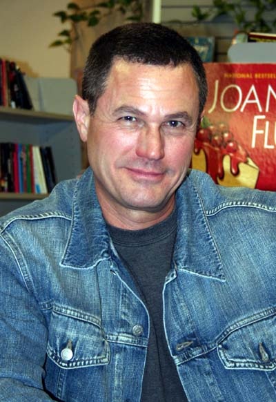
Carson, a 40-year-old former professional surfer, stumbled into graphic design when he was 24 and teaching high school on the West Coast. He came across an advertisement for a two-week design course for high-school seniors and decided to catch that wave. Then his grandmother staked him to commercial art school in Oregon. He stayed all of six months. Carson pestered art directors at surfer magazines until one finally let him intern for free until somebody else was fired. Carson temporarily left Del Mar, Calif., to do short stints at Self and Musician. But he first hit his stride at Transworld Skateboarding. “They had 200 pages every month, in full color, and no budget restrictions,” Carson recalls. “I had an audience that wanted something experimental.”

Equipped with a conveniently inadequate design education (“There’s a conformity that comes out of some of the schools,” Carson says), he changed the public face of graphic design. The pre-Carson problem, as one designer puts it, was that “the modernist grid subverts the personality of the designer to the primacy of the corporate.” Carson shattered the nice, clean, readable grid, scattered headlines and text across overlapping photos, and raised illegibility to an art form. (Carson says that “overall people are reading less,” and he’s merely trying to “visually entice them to read.”) At Transworld Skateboarding and then Surfer, he worked improvisationally. “His work reflects his work habits — disarray,” says Joni Casimiro, his successor at Surfer, with admiration. Once, he accidentally cut his finger on an X-acto knife. He decided he liked the drops of blood that fell on the layout, and left them in the final design.

Transworld Skateboarding wasn’t the most mainstream publication, and neither were the two magazines Carson completely designed himself — Beach Culture and Ray Gun. But they appeared when such companies as Nike and Levi Strauss were looking for ways to make their ads appeal to the generation who squirrel into 7-Elevens on skateboards and say, “Make that two Big Gulps, dude.” They hired Carson and it worked, and on more than just the plaid-shirt crowd. Carson now counts MCI, Ray-Ban and Jaguar among his clients. He’s gone bicoastal, opening a New York office and taking an East Village apartment. LiFe IS gOOD.

In the hypercompetitive design world, however, Carson has his detractors. One is Rudy VanderLans, co-owner of Sacramento’s Emigre Graphics, the Home Depot of the postmodern graphics business, and the source of many of Carson’s favorite fonts. “He’s been the Billy Idol of graphic design,” VanderLans says. “A lot of suburban kids who were afraid of the Sex Pistols could suddenly like him … He’s a ferocious promoter and he has a gigantic ego.”

Which is exactly why Ray Gun publisher Marvin Scott Jarrett fired Carson last fall. Andrew Blauvelt, who chairs the graphic-design department at Cranbrook (the Harvard Law of the field), says, “I don’t find his ads interesting at all. The ads are kind of crude. They just have the hip factor.” There are even grumblings from young designers and illustrators who feel that Carson has taken all the credit for what is essentially a collaboration with them. Carson says, “I’ve never said I’m the one who’s done the whole thing.” And in his most recent talks, he scrupulously mentions other contributors.

But cannibalism — or at least collage-ism — is in the nature of graphic designers. They take this typeface, that photograph, this copy, that illustration, and cobble together a screen, a page, an article, a magazine or a book. They’d rather quibble about who deserves credit for changing recent design history. “If you look back at the dadaists and the futurists in the 1910s,” says ARTnews design director David Walters, “they were doing things that were more unreadable.”

The first postmodernist grid-loosenings occurred in Europe a few decades ago. Americans such as Los Angeles designer April Greiman went over in the ’70s and brought back a Euro-American hybrid (lots of diagonals, lowercase type and color bars poking into the page). Typographic designers like VanderLans and Barry Deck chipped in new fonts (Deck’s oscilliscopish Template Gothic is the hit of the ’90s). But what shook tradition most was the advent, in the mid-’80s, of the Macintosh computer, whose infinitely malleable screen began to replace the pencil and T-square for most designers.

“I’d call Carson a popularizer,” says designer and historian Steven Heller. Carson concurs — with an edge: “I’m experimenting in public. At the design grad schools, these are people sitting around in groups, putting their work on a wall, analyzing it and putting it back in a drawer. I think there’s little risk in that.” Carson himself may be tiring of playing typographic bumper cars. Speak, a new Carson-designed quarterly concerned with “design, culture and a smattering of rock and roll,” debuts in April. “You’re going to see things getting cleaner now,” says Carson. Which is just what you’d expect from someone who’s jumped from a skateboard to a Jaguar.

Peter Plagens, an artist who was also Newsweek’s art critic, wrote this piece; I came up with the idea and did the reporting. I’m including the piece on this website with Peter’s kind permission.

©1996 by Newsweek Inc. Reproduced by permission.

“Mimic,” directed by Guillermo del Toro

Mimic-1997

By Ray Sawhill

“Mimic” is undoubtedly the best mutant-cockroach horror thriller ever made. Even granting that there hasn’t been much competition, this is intended as a high compliment. The director Guillermo (“Cronos”) del Toro’s giddy, elegant scare picture is also a mutant among current movies: it never sacrifices its story or characters to its special effects, and its thrills aren’t extensions of theme parks or videogames. It works on your emotions rather than your nerves.

The script, from a short story by Donald Wolheim, tells a classic nature-takes-revenge-on-us-for-messing-with-her story. Mira Sorvino and Jeremy Northam are scientists who have stopped a cockroach-borne epidemic in New York City by releasing genetically engineered roaches programmed to breed and then die. A few years later signs of a different problem appear: some of the designer bugs may have outwitted their DNA, mutating into scary new forms. The two scientists set out to solve the problem they have created.

A virtuoso at tension and atmosphere, Del Toro orchestrates sounds, shadows and textures with expressionist malice, and sets the action amid damp, vaulted spaces and in tunnels full of forgotten industrial debris — the city as a roach nest. Sorvino, with her air of Yuppie expertise and her face puffy with guilt and fear, is touching as the top bug-fighter. Playing her mentor, F. Murray Abraham hits eerie bass notes. Charles S. Dutton, warm and humorous, is the cop who leads the team underground.

As a yuck!-and-eek! extravaganza, the film is an effective successor to “Scream” — audiences at New York previews have been shrieking, giggling and talking back to the screen. Yet “Mimic” is also a feast for film buffs, recalling such cult favorites as 1985’s “Re-Animator” and the Italian vampire and horror movies of the ’60s. In one long sequence, the investigators take shelter in an abandoned subway car deep under the city. All around are scaffolding and crud; above, far out of reach, beckons an enormous, befogged skylight. The image has the flamboyant poetry that silent movies are still treasured for. Then the giant cockroaches attack. “Mimic” is just an exploitation movie with artistic touches, but it gives us the creeps about all the creatures we share our cities with.

©1997 by Newsweek Inc. Reproduced by permission.

“Smash Palace,” directed by Roger Donaldson

smash palace

Glass Houses

By Ray Sawhill

The only films from New Zealand to receive a major American release in recent years are “Sleeping Dogs” and “Smash Palace,” both directed by Roger Donaldson. “Smash Palace” is about how a husband and wife jockey for position when their marriage goes flat, and it has a beautiful clarity and a plain-spoken elegance. Al Shaw (Bruno Lawrence) has brought Jacqui (Anna Jemison), whom he met and married in Europe, to the New Zealand boondocks. There, tinkering in an auto junkyard, building and racing a sophisticated car, teaching their daughter, Georgie (Greer Robson), how to use tools, and chuckling over snooker and beer with his friend Ray (Keith Aberdein), Al is content. But the chic Jacqui has grown bored. She wants a chance to feel pretty and saucy again; she begins an affair with Ray, takes the child and moves out. Al sputters impotently until, humiliated by a friend of Ray’s, he decides he must have Georgie all to himself, if only for a while, and he hatches a desperate, nutty plot.

The story may sound grim, but Donaldson, who also co-wrote the screenplay (with Peter Hansard and Bruno Lawrence), tells it with unaffected wit. The film is congenial and funny, and it takes you farther than you expect. The warm, powdered light, the authenticity of the details and the patient rhythms bring you in close to Al and Jacqui; the action unwinds out of their deepest yearnings as if that were the most natural way in the world to tell a story. The principal actors let you look right into them: Bruno Lawrence and Anna Jemison keep Al and Jacqui’s inner fires burning ferociously, and little Greer Robson shows you the strength of Georgie’s emotional life.

“Smash Palace” was made on New Zealand’s North Island, a setting that seems both familiar and eerie. Not far from little wood houses, tall grasses and rolling hills that resemble down-home America are a rain forest and a fog-collared mountain — beyond the everyday slumbers something more essential. One long sequence cuts between Georgie, sucking her thumb and clicking a flashlight on and off, as if trying to hypnotize herself into numbness, and, in another room, her quarreling parents. Al and Jacqui trade accusations, scream at each other and come to blows. As Jacqui sobs, Al pulls her clothes off and makes love to her, brutally and despairingly. They lie back against the green and red quilt, and Jacqui, her flushed face streaked with tears and sweat, tells Al she’s leaving him. It’s a daring domestic scene, breathtakingly sustained. Roger Donaldson has made a film that has the surprises, the calm and the inevitability of a classic fable.

©1982 by Newsweek Inc. Reproduced by permission.

“Lullaby Town” by Robert Crais

crais

By Ray Sawhill

Elvis Cole, the hero of Robert Crais’ “Lullaby Town,” does business the California way — it looks like casual recreation to people from less forgiving climates. The genre hasn’t spawned a purer example of mankind in its L.A. incarnation than Elvis. When friends visit, he puts salmon and eggplant on the grill. His wisecracks usually include a movie reference. His detecting skill is always ready to be called on. But why make a big deal out of it?

In “Lullaby Town,” Crais’ third private-eye novel, Elvis is hired by a film director to find his ex-wife and child; the search leads to rural Connecticut and into the heart of a Manhattan mob family. Shivering in the cold and wincing at the filth, Elvis is unable to understand why anyone puts up with life in the Northeast. But he gets to the brutal heart of things in his own way, and he and his ninja-style partner make an impressive team. In terms of lethal efficiency, they’re a match for the bullet-spraying East Coast goons.

Crais has a reader-friendly style, and he’s a meticulous craftsman; the relaxed-seeming plot keeps paying off with scenes of surprising tension. Supple and low key, he’s actually far better at the private-eye-novel racket than most writers who make a loud point of being down and dirty. He gets the job done without losing track of the pleasure.

© 1992 by Newsweek, Inc. Reproduced by permission.

“The Decline of the American Empire,” directed by Denys Arcand

decline-e1550946800792.jpg

By Ray Sawhill

People may compare “The Decline of the American Empire” to “The Big Chill” and “Hannah and her Sisters”; like them, it’s a comic talkfest that takes place in an atmosphere of hypocrisy and comfort. But this French-Canadian film has an unembarrassed, out-of-the-mainstream feel of its own, and no fake portentousness. The story concerns a group of academics gathering for dinner and talking about sex. These conversations — the locker-room talk of sophisticates — are often raucously funny. We recognize that the theories that get spun are expressions in abstract terms of the characters’ personal concerns; we may come to suspect that the “decline” of the film’s title refers to the older characters’ experience of middle age.

Denys Arcand, who wrote and directed, has conceived his film in thoroughly sexual terms; the camera takes us through the web of words and into the characters. When he flashes back, he shows more than his characters divulge — he takes us into their privacy — and all along, he cuts away to images of natural beauty. The relaxed performances and the cinematography, with its attentiveness to changes of light, give us a feel for the characters’ relationship to their flesh, and a sense of how sex to them isn’t merely an athletic pursuit, it’s an imaginative one.

Arcand’s approach has the result of giving sex — the unforeseen effects it can have and the variety of things it can mean to people — a many-hued splendor. In a sequence that begins on a pier at dusk and moves into the evening, we watch the clouds and the water, we hear one of the men wonder whether, if the Soviets bomb the States, he’ll be able to see the explosions, and we see the couples move (in various states of arousal and misery) into bed. This sequence has the emotionality of a nocturne; Arcand gives us the illusion that sex is spiraling around us.

©1986 by Newsweek Inc. Reproduced by permission.